
It’s official: as of April 21, 2015, “mobile friendliness” is now a ranking factor. That means if your site isn’t optimized for mobile browsing, it won’t just leave you with dissatisfied users. It will also result in a ranking penalty.
Even if it’s a small penalty, there’s no point in getting hit with it if it’s easily avoided.
That’s where we come in. Today, we’re going to discuss some of the major guidelines you should follow when translating your site to mobile. These are rules every webmaster should know; familiarize yourself with them and follow them as much as possible.
Let’s get started.
Page Speed Is Extremely Important
Google has used site speed as a ranking factor for some time now, but it’s even more important on mobile devices than it is on desktops. This is because mobile devices are subject to greater restrictions in terms of data, connectivity, and bandwidth.
Not only that, but people’s attention spans are shorter than ever. They only last 8 seconds. Therefore, if your mobile site loads too slowly, people will get frustrated. They will simply go to another site.
You Don’t Need To Block Any Content – But Stay Away From Flash And Popups
Mobile devices are significantly more powerful than they used to be, and capable of displaying a bevy of rich media content ranging from CSS to Javascript to HTML5.
While you should certainly take measures to ensure that rich media and code isn’t too extensive or complex on your site, you no longer need to block any of it.
However, some elements create a poor mobile experience. Since modern Android devices no longer support Flash, and iOS famously doesn’t support it, you should avoid using it.
You should also avoid using popup ads (though why you’d even have them on a desktop site is beyond me; they’re the most hated advertising format on the web).
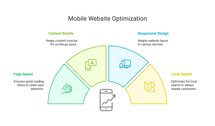
Keep Things Brief
People browsing on mobile devices aren’t looking for a long, involved browsing experience. They’re looking down at their phone while they’re on the go. They’re on the Internet while sitting on the bus, waiting in line at the bank, on their break at work, waiting for the arrival of friends at a restaurant. They have a limited amount of time to spend on any website.
For that reason, if you’re going to design content for mobile devices, it needs to be brief and to the point.
Know That Google Prefers Responsive Design
Although there are several different ways you can design a mobile website (including coding an application for your users), the official word from Google is that it prefers responsive web design.
With this method, the HTML code for the page remains the same. This is true no matter what device accesses it. CSS rules change how the page looks.
There’s no evidence suggesting Google will penalize you for using a different approach. However, there’s also no reason not to follow Google’s recommendation.
Local Search Is Huge On Mobile Devices
Searches made on mobile devices are 66% likelier to have local intent than those made on desktop devices. It’s thus important that you optimize your website for local search. That way, prospective customers will be better able to find you.
Closing Thoughts
The fact that Google now considers mobile friendliness a ranking factor hasn’t really changed much. It has simply reinforced what most smart webmasters already know. That is, it has reinforced that we live in an increasingly mobile world. Anyone who ignores mobile users will inevitably lose out.